There are a number of processes that you can follow to create a custom tooltip that opens a visual or presentation when you hover over a measure in your visual. The tooltip presentation layout is used to create a presentation that is optimized for use as one of these visual tooltips. You can build a presentation of this type, including visuals, static content, and so on, and then define an Action to open the tooltip (using its target) when a user hovers their cursor over an element, cell, or visual in another presentation. You can also create a Target with interactions to one or more of the content items to filter the visuals in the tooltip with reference to the selections in the source presentation.
Note: You can actually use any presentation layout in a tooltip action, but the Tooltip layout is optimized for its purpose. It doesn't include navigation, runtime menus, or master pages and has a maximum size of 500 x 500 pixels. You can, alternatively, create a tooltip action as described in step 3 and use a visual created in Discover to provide the content of the tooltip. For more information, see Tooltip Actions in Discover.
- Click here to learn more about tooltip actions
Creating a Tooltip Presentation
The following example shows what a presentation tooltip, created following this process, might look like:
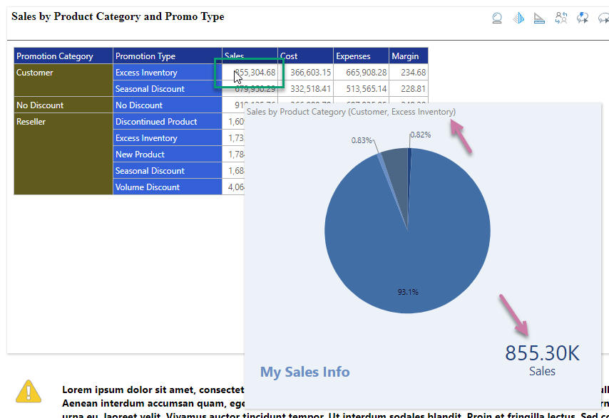
Note: The Action in this runtime example is located on the presentation containing the matrix grid. When you hover your cursor over one of the measures in that grid (green highlight above) the pop up containing the tooltip presentation opens. The content in the presentation tooltip is filtered based on the cell you are hovering over (see breadcrumbs, purple highlight).
Step 1: Create the tooltip
This step is a variant of the standard process for Building a New Presentation in Present Pro. The only difference is that you choose the Tooltip layout from the New Presentation panel.
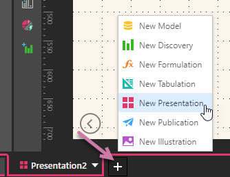
- Create a New Presentation from the App Tabs (purple arrow below) or Home menu (see Accessing a Presentation in Present Pro).
- In the New Presentation wizard, select Tooltip (blue arrow below) from the Choose Layouts panel:
- Add content to the canvas of your tooltip as needed. You might want to consider:
- Adjusting the canvas size for your tooltip. The maximum size for a tooltip presentation is 500 x 500 pixels.
- Adding visuals and other content items, such as text fields and shapes or images, to your tooltip.
- Save your tooltip presentation.
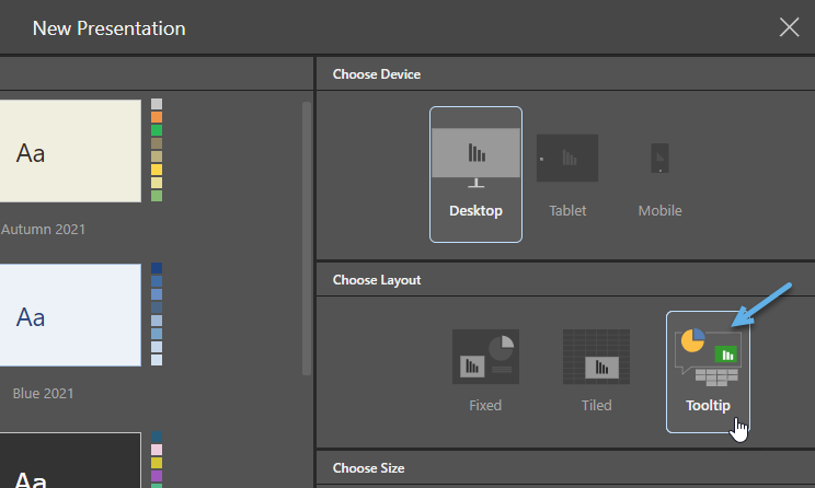
Note: Tooltip is only offered as a Layout option where the selected Device is Desktop. Once selected, the Size options are disabled. For details about the other options on this page, see Building a New Presentation in Present Pro.
Step 2: Create an interaction from a Target (optional)
If you want the content items in your tooltip to be cross-filtered in response to the cell that you hover over, you need to create a Target and then create interactions between the target and the content items:
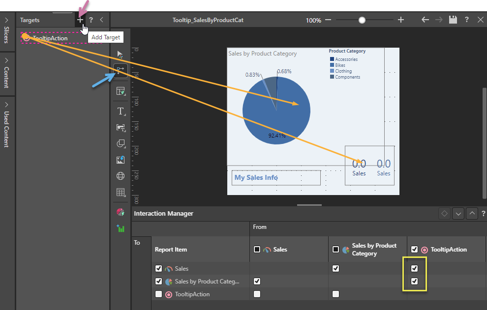
- Click New (purple arrow above) to create a target in the Targets panel.
- Create interactions between your target and the content items in the tooltip, by doing one of the following:
- Open the Interaction Manager, and, in the From column representing the target, select the intersection with the visuals that you want to enable (yellow highlight).
- With the Targets panel docked, select the Interaction Picker (blue arrow) and drag and drop to create the interactions between the target and the visuals.
- Save your changes.
Tip: You are going to need to select this target in the next step, so we recommend that you right-click Rename Target and choose a meaningful name.
Step 3: Create a Tooltip Action
The last step in the build process is to open the presentation that you want to add the tooltip to and configure the Tooltip Action that opens the tooltip. You open the Action panel by selecting the visual that you want to add the tooltip to and either right-clicking Actions in the context menu or selecting the Actions button on the Component ribbon (purple arrow below).

The Action panel opens at the bottom of the page:
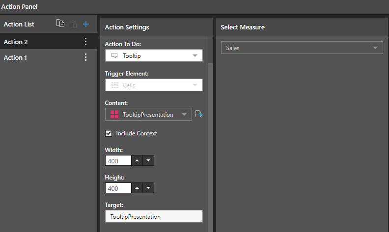
From the Action Panel:
- Set Tooltip as the Action to do.
- Open the Content dropdown list and select the required visual or presentation from the Content tree.
- Optionally, select Cell + Filters from the Include Context dropdown list to filter the report tooltip by slicers and interactions performed in the current query (measures will not be injected into the tooltip).
- Set the Width and Height of the tooltip container as needed.
- Where the content is a presentation and a target is used for the interaction, supply the Target name.
- Choose the Relevant Measure that should drive the tooltip action. When you hover over the selected measure column, the tooltip opens. Note: You can select any single measure or make no selection from the Measure tree to choose All Measures. In the latter case, the tooltip is driven by every measure in the query.